Today, UDW is excited to launch a new statewide storytelling campaign—along with a whole new look and feel—inspired by the courageous and dynamic nature of our membership and our commitment to the issues that matter most to our communities.
With this brand refresh, we are stepping boldly into a brighter future where the 170,000+ hard-working home care and child care providers of UDW are no longer asking for dignity and respect: we’re commanding it.
UDW members have worked for decades to build our union and have wielded our considerable strength, expertise, and emotionally impactful stories to make strides for workers and communities time and again. We are proud to launch a new look and feel that reflects the real power of the work we do.
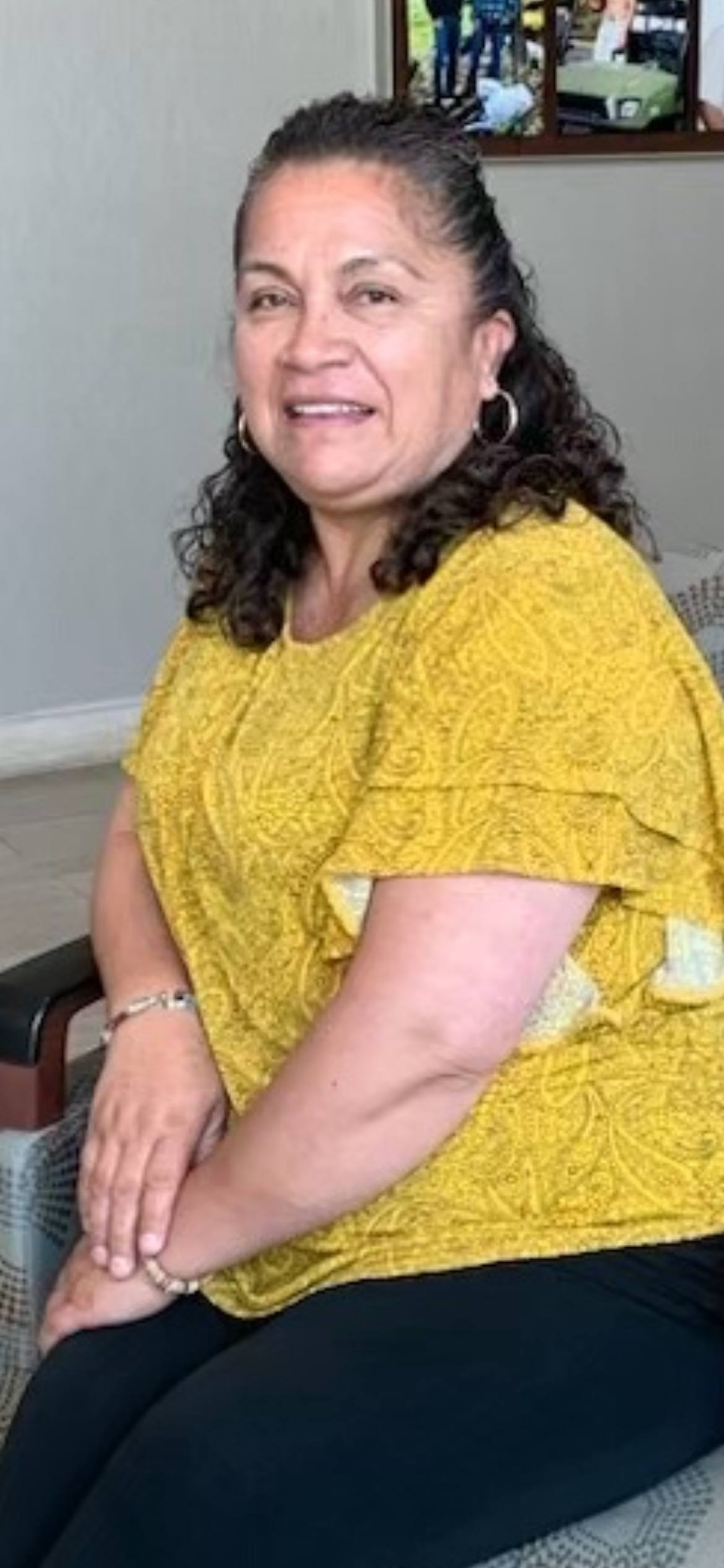
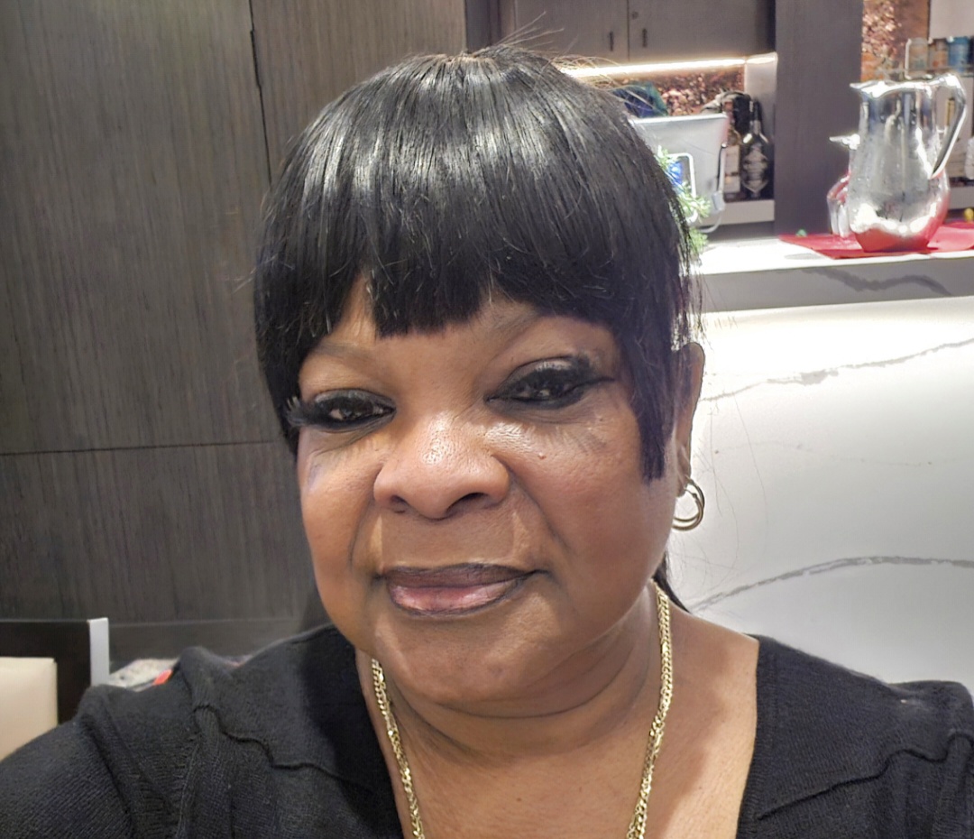
Spotlighting UDW member stories and daily impact
Home care and child care workers are often overlooked, under-appreciated and misunderstood—despite our life-altering impact on millions of Californians and the economy. Our member-focused storytelling shows ‘a day in the life’ and speaks to the many challenges we face, like the pursuit of essential workers’ rights, and the fight for a thriving wage.
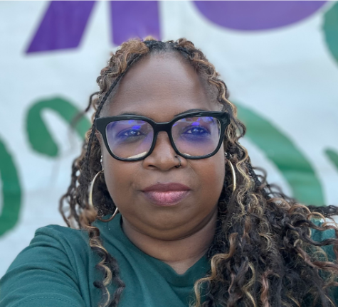
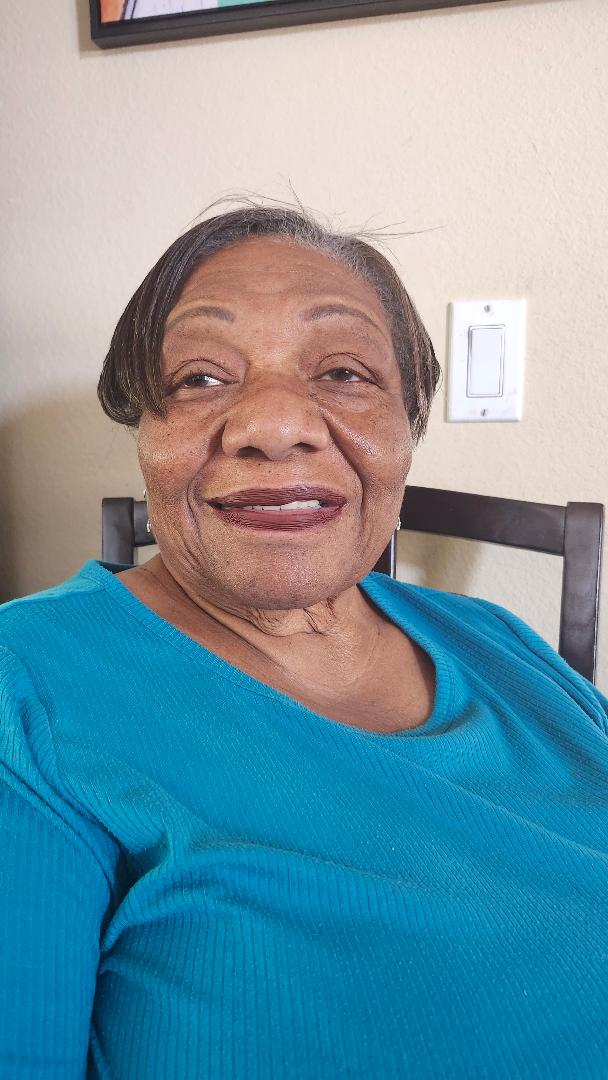
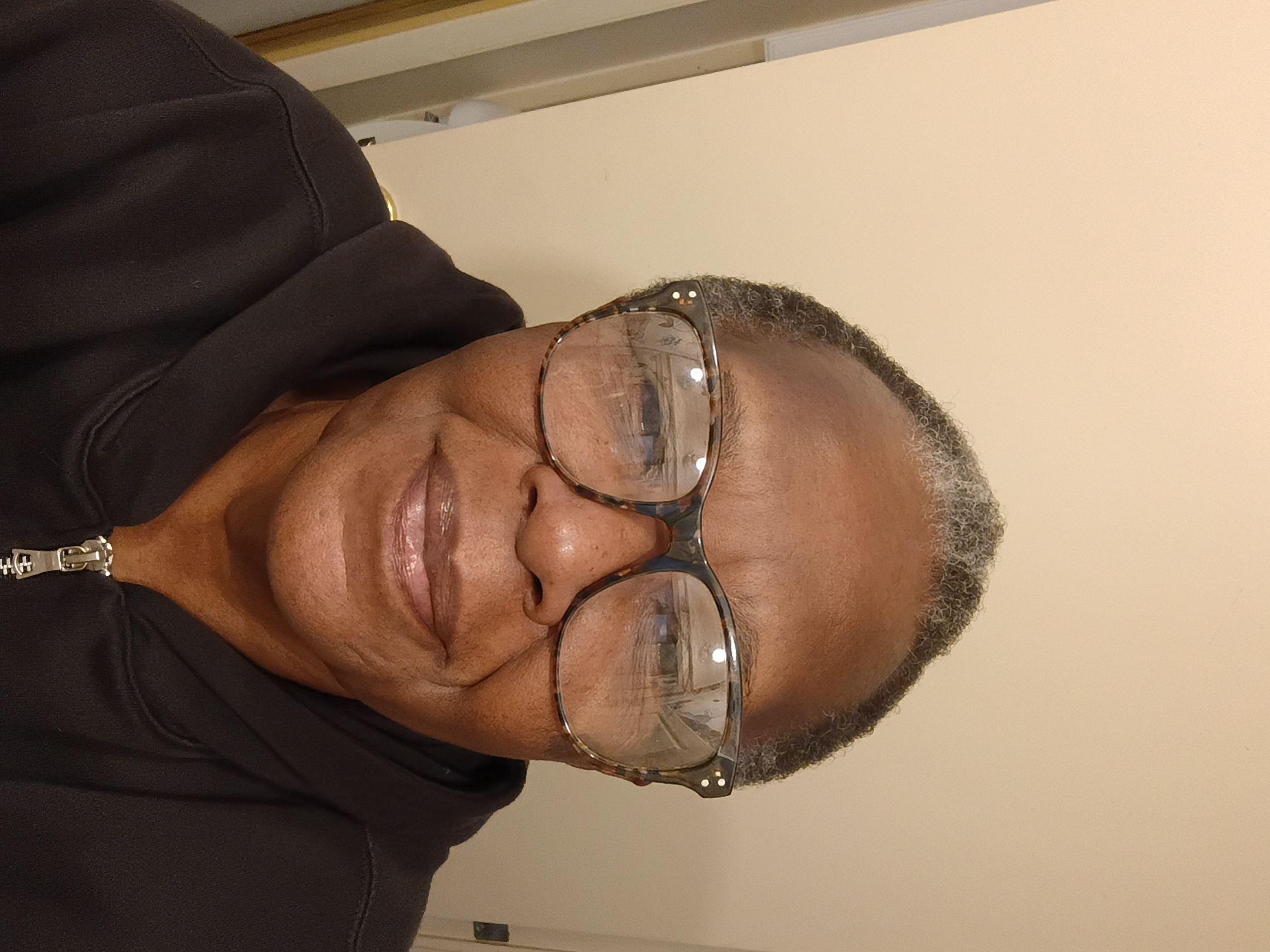
We invite you to get to know just a few of the UDW members who—like all domestic workers—make all other work possible. Watch and learn more about the professionalism and heartfelt care that we give to our clients and our communities every day.
Anchoring our new visual brand
Power, powerful, empowered.These words come up constantly in conversations we have with UDW members and supporters—giving us an important anchor for our brand.
UDW members know the value of our work and fully believe that we have the power to transform society. In our brand, you’ll see this come to life in a few ways:
Our logo: The dot in the stylized ‘W’ represents how each individual UDW member makes up a larger community, with every single one of us adding value in our own way. This simple but impactful element is an expression of our collective power.

Our brand colors: To balance both the professionalism and boldness that our union stands for, we chose colors that represent stability and energy. The greens represent the trust, nourishment, and growth we strive for, while the attention-grabbing oranges represent the dynamic and vibrant nature of our membership and the courage and hope we bring to our mission and our work.

Professionalism.At the heart of our rebrand lies a deep recognition of the unwavering professionalism of UDW members. We are not “babysitters”; we are trained, skilled professionals whose expertise is the backbone of our community’s well-being. Our branding mirrors this truth, portraying a sophisticated and competent image that aligns with the high standards we uphold every day.
Respect. Gone are the days when home care providers and child care workers must beg for the respect we deserve. In our renewed brand narrative, respect is not a plea; it’s a given. This UDW rebrand recognizes our invaluable contributions as fundamental to the social fabric. The work we perform is not just a service; it’s a testament to our commitment to our community’s health and prosperity.
In closing
As we embrace this new chapter in UDW’s visual story, our commitment to supporting and amplifying the voices of our members and communities remains steadfast.
We will continue to elevate, empower, and fight for UDW members and the children, seniors, and people with disabilities in our care. We will not stop until we’ve built a world where everyone can thrive, where every person’s needs are met, and where every single one of us has dignity.